
image-4.png

Exhibitors Do Not Rebook Because of the Coffee. They Rebook Because People Found Their Stand.

Exhibition Wayfinding and Exhibitor ROI: People Rebook the Shows Where Visitors Found Their Stand

Exhibitors do not rebook because the coffee was good. They rebook because people found their stand.

That is the commercial reality many organisers confront late on day two, when the far halls begin to thin out and the complaints start to sharpen. If visitors never reached a stand, the post-event story quickly shifts from results to excuses.

This matters more as the GCC events calendar tightens through 2026 and 2027, driven by Vision 2030 investment and a growing pipeline in Riyadh and Jeddah. As more shows compete for exhibitor budgets, exhibition wayfinding and exhibitor ROI move from operational detail to renewal driver.

Rebooking starts with navigation, not the sales team

Organisers often treat rebooking as a commercial task: pricing, account management, upsells, early commitments. Those matter. But the fastest route to “book us again next year” is more basic: make it easy for attendees to reach the stands they planned to visit.

If an exhibitor’s return depends on stand traffic, then conference floor plan navigation sits upstream of revenue. A poor location can hurt performance, but poor navigation widens the gap between prime positions and everyone else.

Research frequently cited in event-tech circles suggests exhibitions can lose up to 20% of potential exhibitor value when visitors fail to find the stands on their list. That loss rarely spreads evenly. It tends to hit back halls, corner plots, and first-time exhibitors that lack the brand pull to overcome friction.

Featured snippet: How navigation affects exhibitor value

Q: How does navigation affect exhibitor value at an event?
A: Navigation affects exhibitor value by determining whether attendees can reach the stands they intend to visit. When visitors cannot find exhibitors, shows can lose up to 20% of potential exhibitor value, reducing stand traffic, weakening ROI, and lowering the likelihood of rebooking.

The attendee agenda is simple: where is my next session?

Most attendee complaints sound like content problems: the room was full, the keynote was missed, the workshop started before they arrived. Often, the deeper issue is movement. People could not cross the venue with enough certainty to stay on schedule.

That is why event attendee navigation now matters more. Agendas are tighter, venue footprints are larger, and expectations are shaped by consumer mapping apps that tell people not just where to go, but how long it will take.

At a live event, attendees make dozens of small trade-offs. One more meeting or the panel. A supplier visit or a coffee queue. Hall 2 now or later. If the wayfinding system cannot answer a basic timing question, people choose the nearest option. Premium stands grow busier. Entire aisles disappear from the day.

Printed floor plans expire faster than organisers think

A floor plan is only final for a moment. Booth builds change. Fire-lane adjustments force renumbering. Session rooms move. Entrances close for crowd control. Yet printed maps keep circulating long after they are wrong—on lanyards, PDFs, screenshots, and WhatsApp threads.

The damage compounds quickly. Attendees arrive late to paid sessions. Exhibitors blame placement. Operations teams spend the day answering the same directional questions. What looks like a signage issue often turns into a footfall problem.

A live map beats more static signage

The answer is not simply more signs. It is a publishable map: one source of truth that organisers can update for each show and distribute anywhere attendees already look.

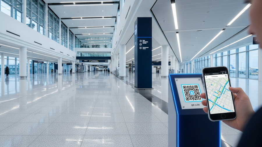
QR-linked maps work because they remove friction. No app download. No login. Attendees scan, search, and route in a browser on the device already in their hand.

Platforms such as Veenux support this model by letting organisers build event-specific maps and share them through QR codes on badges, venue signage, and event websites. The important shift is operational: the map stops being a static asset and starts functioning as a live service.

Digital wayfinding creates a new kind of event inventory

Once navigation moves into a digital layer, organisers gain something physical floor space cannot easily provide: new visibility inventory. Promoted placement, sponsored routes, and themed trails can help exhibitors attract attention without redesigning the hall.

Used carefully, this improves the attendee experience rather than cluttering it. A highlighted sustainability trail, a “start here” route for first-time visitors, or a promoted exhibitor category can reduce wrong turns and speed up discovery.

That also softens the back-hall penalty. Exhibitors who missed premium physical locations still have a way to appear in the decision paths attendees follow across the venue.

Exhibition wayfinding and exhibitor ROI need evidence, not anecdotes

Exhibitors increasingly want proof. Not that the hall felt busy, but that their stand earned attention. That pushes organisers toward metrics they can defend: estimated pass-by traffic, route heatmaps, peak periods, and comparisons across similar zones.

This is where visitor flow analytics matter. Not as a dashboard for its own sake, but as a way to improve the next show. Organisers can release sessions deeper into the venue, reposition food and networking nodes, or adjust aisle signage where dead ends suppress movement.

It also gives sales teams a stronger renewal story. Not just what sold last year, but what changed, what improved, and why a stand location or sponsorship package should perform better next time.

Better navigation helps first-time attendees come back

Navigation does more than direct traffic. It lowers the cognitive load of large venues and helps first-time attendees move with the confidence of regulars. That matters in a regional market expanding into mixed-use venues, festival formats, and mega-events.

Saudi planning tied to 2034, including FIFA Fan Festival sites in each host city, points to a near future where physical movement and digital guidance must work together under pressure. In that environment, wayfinding is no longer a support function. It shapes whether people get value from the event at all.

The clearest insight is also the simplest: when attendees find the stands, sessions, and zones they came for, organisers protect the metric that matters most. Renewals follow traffic before they follow pitch decks.

For organisers assessing QR-based event maps and post-show flow reporting, reviewing how platforms such as Veenux approach live mapping and analytics is a practical place to start.

image-3.png

Open Day Is a Sales Day. Twenty Minutes Lost Looking for Building C Costs You Applications.

University Open Day Experience 2026: Twenty Minutes Lost Finding Building C Can Cost You an Application

An open day can shape an application decision in a single afternoon. If a family spends twenty minutes trying to find the engineering building, they may miss the one session that would have tipped the balance.

That risk is sharper in the university open day experience 2026 cycle. Admissions teams are competing with higher travel costs, tighter schedules, and rising expectations for self-serve information. In the GCC, many universities are also expanding conferences, exams, and community events as secondary revenue streams, bringing more first-time visitors onto campus each year. More visitors, less patience for friction.

1) Treat the campus visit as the final step before the application

If you’re asking does campus visit affect application decisions, the practical answer is yes. A visit compresses hundreds of micro-impressions into a few hours, and navigation shapes more of them than institutions often admit.

When wayfinding breaks down, everything else absorbs the damage. Late arrivals look like disorganization. Missed sessions feel like poor planning. Long help-desk queues suggest under-resourcing. Visitors rarely separate the navigation failure from the institution itself.

Campus research consistently ranks findability among the top user priorities, ahead of more advanced smart campus features. That offers a clear operational lesson for recruitment teams: before adding new experiences, remove the friction that stops families from reaching the experiences already in place.

Featured snippet: Why does campus navigation matter for student recruitment?

Why does campus navigation matter for student recruitment? Campus navigation affects recruitment because the visit often becomes the deciding moment for applicants and their families. Time lost finding buildings is time not spent in talks, tours, and staff conversations, and that confusion becomes part of the institution’s overall impression.

2) Map for parents and guardians, not just prospective students

Most open day planning still centers on the student. But campus wayfinding visitors parents is often where conversion weakens. Parents are more likely to drive, arrive early, manage accessibility needs, and judge how well the campus operates as a proxy for safety and competence.

That means planning for two parallel journeys.

Student journey: subject talks, labs, accommodation tours, student panels.

Parent journey: fees, careers, safety, wellbeing, transport, entry points, and exits.

Navigation should support both. That includes parking-to-registration routing, step-free paths, clear building names instead of internal abbreviations, and reliable “you are here” anchors at decision points.

3) Stop using volunteers as human signposts

When volunteers spend the day pointing at buildings, universities lose two things at once: conversion moments and staff energy. The best ambassadors should be discussing courses, outcomes, and student life, not explaining which corridor leads to Block C.

Offloading basic navigation allows teams to focus on higher-value interactions: answering academic questions, managing queues, and capturing follow-up interest. It also reduces a fragile dependence on local knowledge, which often breaks down under crowding, bad weather, or last-minute room changes.

There is a psychological cost as well. Being sent the wrong way even once can undermine confidence in the day. Visitors may recover the lost time, but not always the impression.

4) Measure sessions reached per visitor, not just footfall

Open days are expensive and difficult to repeat, yet many institutions still judge them by registrations and headcount alone. For campus visit conversion applications, a more useful metric is simple: which sessions did visitors actually reach?

That measure exposes where friction sits. It may reveal timing gaps between talks, confusing building clusters, or signage deserts between the main gate and academic areas. It also helps admissions teams identify which sessions correlate with applications and which look strong on paper but remain hard to access in practice.

Footfall tells you who came. Session reach tells you what they experienced.

5) Plan for international families and multilingual support

International families and first-time visitors are often least able to “just ask someone.” Language barriers, unfamiliar campus norms, and time pressure can turn minor confusion into missed sessions.

PwC has reported that 78% of Gen Z prefer digital wayfinding. The expectation is now clear: navigation should work more like a consumer map—immediate, searchable, personal, and available in more than one language.

Practical steps are straightforward. Publish directions in multiple languages. Use landmark-based instructions, not only building codes. Make key destinations searchable by the names visitors use, such as “Engineering,” “Admissions,” or “Scholarships,” rather than internal room labels.

6) Build one navigation system for open days, exams, and events

Wayfinding should not be rebuilt for every event. The same campus that hosts open days is also guiding visitors through graduations, entrance exams, and external conferences. In the GCC especially, event hosting is becoming a larger part of university operations.

A consistent approach to navigation for parents and visitors on campus reduces confusion year-round and creates cleaner operational data. It also shifts navigation from a one-off event task to a campus capability.

A practical model: browser-based, event-specific campus maps

One pattern emerging at Saudi universities is the use of browser-based visitor maps that can be updated by event. Veenux, for example, supports QR-shared maps, event-specific layouts, and multilingual routing without requiring an app download. The broader point is not the tool itself. It is the operating model: one map layer that can change as the campus and the event change.

Navigation is part of the recruitment pitch

An open day is a recruitment environment disguised as a campus tour. When visitors arrive late, miss talks, or feel embarrassed asking for directions, that friction becomes part of the brand they take home.

The answer is not more signs alone. It is a navigation strategy that institutions can measure, adapt, and reuse across events. Universities that reduce wayfinding friction give families more time for the conversations that drive decisions.

If the campus visit is the last step before the application, navigation deserves the same attention as the pitch itself. Learn more at veenux.com.

image-2.png

Your Tenant Says the Footfall Is Not There. Do You Have the Data to Answer?

Mall Footfall Data for Leasing: Do You Have the Facts to Answer Tenants?

Every leasing team hears the same complaint: nobody walks past our shop. The difficult part is that tenants are often right, and many operators still cannot prove why.

That gap matters more in 2026. Across GCC malls, leasing pressure is rising even as operators report strong seasonal peaks. Al Futtaim, for example, reported about 8% average sales growth across its UAE malls over Ramadan and Eid 2026, with its flagship posting 12% sales growth and 5% footfall growth. When the headline says traffic is up but individual tenants report quiet corridors, renewal talks quickly turn into a battle of anecdotes.

This is where mall footfall data for leasing stops being an analytics exercise and starts becoming commercial evidence. It helps operators separate two very different realities: a mall with weak traffic, and a unit that sits outside the routes shoppers naturally take.

Why dead zones exist: routes, friction, and missed visibility

Leasing teams already price space according to gravity. Anchors, food courts, crossroads, and strong sightlines command premiums. Remote ends and poorly connected wings attract discounts. Retail leasing guidance has long described these low-flow areas as dead zones.

The mistake is treating those discounts as fixed truths rather than measurable outcomes. Dead zones often emerge from routing friction: a corridor that looks connected on a floor plan but feels hidden in real life; an escalator that channels people down one path instead of another; a digital directory that fails to turn intent into a clear route.

That is why the question why some mall units get no traffic rarely points to luck. More often, it points to the map, the journey, and the way the mall directs movement.

What mall footfall data for leasing changes in renewal meetings

When a tenant asks for rent relief, the first question should not be whether overall footfall rose. The useful question is sharper: how many people passed this unit, how long did they stay nearby, and how much of total mall movement reached this wing at all?

Tenant traffic analytics for shopping centres matter most when they are zone-based and comparable over time: before and after a campaign, before and after a layout change, or during Ramadan versus ordinary trading weeks. That framework helps leasing managers distinguish between three scenarios that require very different responses.

1) The mall is healthy, but the unit is bypassed

Flow mapping may show strong movement in the core and sharp leakage before the tenant’s corridor. That points first to a wayfinding, routing, or merchandising issue, not immediately to a rent problem.

2) The wing is structurally under-visited

Zone-to-zone transitions may show persistent drop-off into a secondary area. This is where dead-zone language becomes useful. You are no longer describing sentiment; you are quantifying how much exposure the location truly loses.

3) The unit gets passersby, but not entrants

Dwell may be low and conversion weak even when traffic passes the frontage. That suggests a visibility problem, an offer mismatch, or weak store execution rather than a pure location failure. In retail rent negotiation with footfall evidence, that distinction matters.

Featured snippet: how visitor data changes tenant conversations

Q: How does visitor data change tenant conversations in a mall?
A: Visitor data replaces opinion with evidence. It shows how many people passed a unit, where shoppers actually moved, how long they stayed nearby, and which routes failed to reach a wing. That lets operators diagnose the real issue before defaulting to rent discounts.

Mall footfall data for leasing is only half the story

Footfall shows where people went. It does not fully explain where they meant to go. That distinction matters because some underperforming units suffer from low visibility, while others lose demand before shoppers ever arrive.

Mappedin’s 2026 venue research found that 53% of visitors experience navigation problems and 50% of visits are discovery-led. That combination is revealing. Even when shoppers are not searching for a specific store, they still choose where to wander, and friction pushes them back toward the simplest loops.

For quiet wings, discovery-led traffic is often the most recoverable demand. Operators cannot manufacture intent, but they can reduce ambiguity with clear digital maps, strong search, and step-by-step guidance that makes a secondary wing feel connected rather than peripheral.

Search behaviour reveals demand that never reaches the store

Footfall tells you where visitors walked; directory search data tells you what they tried to do. When shoppers repeatedly search for a category or brand and still fail to arrive, the problem is larger than customer experience. It becomes leasing intelligence.

Using visitor data in lease negotiations becomes more credible when operators can say: the mall generated strong search demand for your brand or category; a high share of those searches began in zones that rarely transition to your wing; and average time-to-arrival is longer than for comparable units. That gives tenants something harder to dismiss because it ties their complaint to observed customer behaviour.

Turn traffic reports into a tenant service, not a dispute

The strongest operators treat analytics as a shared diagnostic, not a defensive report. If a tenant asks how to prove footfall to mall tenants, the answer should not be a static PDF once a year. It should be a consistent monthly baseline built around three measures.

Flow: passersby by frontage and corridor
Dwell: time spent in the micro-zone around the unit
Search-to-arrival: how often visitor intent turns into an actual visit

This changes the tone of rent relief discussions. Operators can support legitimate claims when a wing underperforms, while also proposing fixes that are measurable: better wayfinding, entrance rebalancing, signage, pop-up programming, or revised directory logic. The tenant gains transparency. The mall gains options beyond discounts.

Use evidence to rebalance tenant mix

Industry analysis often argues that malls using footfall analytics can improve leasing revenue, with figures of up to 20% attributed to McKinsey in industry discussions. The mechanism is straightforward: operators stop treating all underperforming space as interchangeable.

Zone analytics can show which categories pull visitors into secondary corridors, such as services, children’s offers, impulse food, or value retail, and which categories depend on already-committed intent. That helps answer a harder leasing question: does this wing need a destination tenant, a service cluster, or a stronger discovery loop rather than another apparel store waiting for incidental traffic?

Where platforms like Veenux fit

Some platforms now connect indoor wayfinding with analytics, so helping visitors navigate also creates operational evidence. Veenux is one example used by malls that want a shared map accessed by QR, along with indoor analytics by zone and search and directory data that show what visitors looked for and whether they reached it.

That matters because the same system can surface a problem and test a remedy. A quiet wing does not just need measurement. It needs better routing and a way to verify whether the change improved exposure.

Bring better evidence into the next renewal meeting

Renewals fail when both sides argue over the same invisible issue: how many people had a real chance to see the store. In 2026, seasonal peaks have made the gap between mall-wide performance and unit-level reality harder to ignore. When tenants ask for relief, evidence is no longer optional.

Bring three numbers into the room: passersby, dwell, and search-to-arrival. Those metrics will not remove tough negotiations. They will, however, anchor the conversation in observable facts and reveal fixes that may cost far less than losing the tenant.

If your leasing discussions still rely on instinct, start with the movement data behind the complaint. The answer is usually already in the route.

image-1.png

Thirty Percent of Late Patients Say They Got Lost. Your Clinic Pays for That All Day.

Late Patients and Clinic Navigation: Why 30% Say They Got Lost—and Why Your Clinic Pays for It

A patient who arrives fifteen minutes late does not create one delay. They push the final appointment of the day into overtime, strain the front desk, and turn tomorrow’s schedule into a rescheduling problem.

In 2026, access is no longer a soft experience metric. It is an operational constraint. Waiting lists, productivity targets, and staffing shortages are forcing hospitals to recover capacity without adding rooms or headcount. Some of that lost capacity is hiding in plain sight: late arrivals and missed visits that better clinic navigation could prevent.

That is the uncomfortable part. A meaningful share of what gets labeled “patient behavior” starts as a building problem. Multiple studies and operational reports point to the same pattern: around 30% of late patients say difficulty finding their destination contributed to the delay. Improving late arrivals clinic navigation is not a facilities upgrade. It is throughput management.

Lateness often starts with the building, not the patient

Hospitals are complex by design. They have multiple entrances, renamed departments, temporary construction routes, and outpatient clinics buried inside inpatient corridors. A first-time patient can leave early, park on time, arrive on campus, and still lose ten minutes at the last mile.

One wrong entrance, one identical-looking lobby, one lift bank that stops on the wrong floor—that is enough to break the schedule. The clinic still records a late arrival. Staff still absorb the disruption. The source of the delay does not change its operational cost.

That cost is measurable. Reported estimates place the cost of missed appointments in hospitals at roughly USD 265 per no-show in some outpatient settings. No-show rates of around 18% remain common in ambulatory care benchmarks. Emory University Hospital has reported more than USD 200,000 in annual losses tied to lateness and schedule disruption. Surveys also suggest that about 40% of hospitals report staff time lost because patients arrive late or do not arrive at all.

Why one late arrival disrupts the whole clinic

Clinics run as sequenced systems. A delayed check-in does not create a single gap. It shifts rooming, vitals, imaging, clinician time, pharmacy coordination, discharge, and transport.

If staff still see the late patient, every appointment after them gets compressed. If they do not, the slot goes unused and access teams inherit the rebooking work. Either way, the clinic pays twice: once in lost time and again in added administrative load.

That is why efforts to reduce missed appointments through hospital wayfinding belong in the same conversation as staffing models, overbooking rules, and template design. A navigational delay is schedule risk.

Featured snippet: Can wayfinding reduce missed and late appointments?

Yes. Around 30% of late patients report trouble finding their destination, and hospitals that improve wayfinding have reported reducing late arrivals by up to 25%. The effect extends beyond one patient: a single delayed arrival can disrupt every appointment scheduled after it.

Send the route before arrival, not after confusion starts

Many wayfinding interventions start too late. Signage, kiosks, and help desks matter, but they assume the patient will solve navigation after reaching the building. By then, the most consequential decisions have already happened: where to park, which entrance to choose, and how far the walk will be.

If the goal is to reduce patient late arrivals and no-shows, the intervention should start with the appointment reminder. A route link changes the message from “be here at 10:00” to “here is how to reach the correct waiting area from your parking location.” That cuts uncertainty before it turns into delay.

The impact can show up quickly. In one NHS trust trial, missed appointments reportedly fell from 141 to 114 in the first month after wayfinding changes. That is not a branding result. It is an operations result.

The first five minutes determine whether the patient is late

For outpatient access leaders, navigational loss is easiest to understand in the first five minutes after a patient arrives on site. That is when they make decisions that are hard to reverse.

Which car park they choose affects the walking route.
Which entrance they use determines whether they start in the right part of the campus.
Which vertical route they take—lift, escalator, or stairs—can add several more minutes.

A patient can be on time to the hospital campus and still arrive late to the clinic. That distinction matters, because many attendance problems happen in that gap between arrival and check-in.

Healthcare-specific digital navigation addresses that gap differently from a generic map link. In practice, providers such as Veenux deliver route guidance by link or SMS, guiding patients from the car park to the correct entrance, lift, and waiting area without requiring an app download. In multilingual environments such as GCC hospitals, that matters even more. Deployments in systems including NMC Healthcare reflect how campus complexity and language access shape attendance in everyday operations.

Measure lateness like a diagnosable access problem

If hospitals cannot see where delays begin, they default to blaming the patient. The better question is not simply whether hospital navigation affects attendance rates. It is whether lateness can be traced to specific friction points.

Track late arrival rates by clinic, entrance, and time of day

Break lateness down by specialty, site, and appointment block. If one clinic slips mainly during morning sessions when parking fills early, the root cause is arrival flow, not clinician performance.

Capture where patients entered at check-in

A simple structured field at reception or in digital pre-check can reveal repeat wrong-entrance patterns. That turns anecdote into usable operational data.

Measure disruption, not just lateness

Track downstream effects: room idle time, clinician overrun minutes, rebooking volume, and staff overtime. Those indicators show the real cost of navigational failure.

The cheapest capacity to recover is the capacity already scheduled

Hospitals spend heavily to add supply: new clinic sessions, extended hours, extra rooms. Yet one of the most accessible sources of capacity sits upstream of care delivery. It is the attendance that should have happened on time but did not because the path from car park to clinic broke down.

If a missed slot costs hundreds of dollars and a late slot disrupts every patient after it, then clinic navigation deserves attention as part of access strategy, not just facilities management. The practical move is straightforward: put the route where the patient already is, on their phone, before they arrive, and measure what changes at the clinic level.

Hospitals do not need to build new capacity before they recover the capacity they are already losing to confusion. For teams assessing that opportunity, Venux offers one example of how indoor navigation can be built into the patient journey.

image.png

Some Passengers Ask for a Wheelchair Because They Cannot Face the Walk. That Is a Wayfinding Problem, Not a Mobility One.

Airport Wheelchair Assistance Demand Is Often a Wayfinding Problem, Not a Mobility One

Some passengers request a wheelchair at large airports not because they cannot walk, but because they cannot judge the walk. They do not know how far the gate is, how long it will take, whether the route is step-free, or if they will still make boarding.

That distinction matters. As airport wheelchair assistance demand rises, many airports still frame the issue as cost, misuse, or fairness. For CX directors, PRM managers, and terminal operations teams, the more useful lens is operational: when uncertainty gets processed as “special assistance,” capacity tightens first for passengers who genuinely depend on it.

The numbers explain why this has become an executive issue. Industry reporting shows PRM passengers rising from 0.82% of traffic in 2019 to 1.00% in 2023—a 21% increase—while the average PRM charge per departing passenger moved from EUR 0.57 to EUR 0.71. On a single ticket, the cost looks modest. Across a network, it becomes a reliability problem: more requests, longer waits, tighter crew utilization, missed connections, and more complaints on both sides of the service desk.

Why airport wheelchair assistance demand is rising faster than disability growth

It is tempting to treat rising wheelchair volumes as a simple split between legitimate mobility need and illegitimate queue-jumping. The reality is more complicated—and more actionable.

A single PRM wheelchair request can reflect two very different needs.

Mobility limits: the service is essential

Passengers with reduced mobility, chronic conditions, or temporary injuries may need motorized transport, step-free routing, and staff support through complex terminal environments. For these travelers, assistance is not optional. Delays quickly become a dignity issue.

Terminal uncertainty: the building itself feels risky

Another group can physically walk but cannot confidently answer basic questions: How far is the gate? How long will it take? Are there stairs? Is there anywhere to rest? If I start walking now, will I make boarding?

When the terminal feels opaque, requesting help becomes the safer choice. The wheelchair functions as insurance against getting lost, running out of time, or encountering barriers en route. That helps explain why airport wheelchair assistance demand can rise faster than the population of passengers with disabilities.

Featured Q&A: what is driving more wheelchair requests at airports?

Q: Why is demand for airport wheelchair assistance rising faster than the number of passengers with disabilities?
A: Because many requests do not stem from mobility limits alone. They also reflect navigational uncertainty. When passengers cannot judge distance, time, or accessibility barriers, they request assistance they might not need if the route were clear.

What passengers are trying to know before they ask for help

Many airport apps and signs assume a confident traveler who already understands the terminal’s logic. In practice, the question behind many help requests is not “carry me.” It is “reduce the risk.”

Most passengers are looking for four things:

• Distance and walking time to the gate, not just a gate number
• A step-free route, including lifts, ramps, and no-stairs options
• Rest points such as benches, quiet areas, or short-stop zones
• A timing decision: if they leave now, will they still make boarding?

ACI’s ASQ work shows why this matters. The ACI ASQ 2026 Global Traveller Survey identifies anxiety reduction as a core passenger need; the program surveys 700,000+ passengers a year across 400+ airports. Anxiety is not a soft metric when it converts directly into staff-intensive service demand.

The problem is compounded by poor accessibility infrastructure. Only about 16% of airports have accessible flight information displays. That leaves many travelers—especially those with visual, cognitive, or situational constraints—to improvise their own navigation strategy in a time-critical environment.

How airports can reduce wheelchair requests without gatekeeping

If uncertainty drives demand, stricter eligibility policing is the wrong response. The better intervention is clarity before the request is made.

The operational goal is straightforward: help passengers who can walk to the gate do so with confidence, while preserving assistance capacity for people who truly need it. That means showing the route, walking time, and step-free option early enough for the passenger to make an informed choice.

This is where digital wayfinding becomes a demand-management tool rather than a passenger-experience extra. Some airports already use shared mobile maps accessed by QR, with walking times and accessible routing visible before a passenger enters an assistance workflow. King Khalid International Airport is one example. The lesson is simple: route transparency works best in the channels passengers already trust—their phones, at decision points, under time pressure.

How to measure the problem without asking passengers to defend their needs

Airports do not need to interrogate passengers to manage demand more intelligently. They can measure the environment and watch for patterns.

Track uncertainty signals, not personal attributes

PRM booking timestamps, especially last-minute spikes
Repeat wayfinding questions at information points
Dwell patterns near decision nodes such as security exits, retail crossroads, and pier splits
Missed boarding incidents correlated with long walking distances

Compare assisted and independent outcomes

When airports add clearer walking-time guidance, step-free routing, and shareable maps, they should measure changes in:
short-notice wheelchair requests
average wait times for assistance crews
complaints from PRM passengers who depend on the service

This is also the cleanest political path. It reduces avoidable demand without forcing the airport into the role of arbiter.

A capacity problem disguised as a compassion debate

The debate over special-assistance costs often stalls at bad actors versus justified need. For airport operations teams, the sharper question is different: how much of this demand is a response to navigational uncertainty?

When passengers cannot estimate distance, time, and accessibility constraints, outsourcing the risk to the airport is rational. One common way they do that is by requesting a wheelchair.

Solving that does not weaken accessibility. It strengthens it. Every request prevented by better wayfinding protects capacity for passengers who truly require assistance. For airports trying to reduce special-assistance demand and help more passengers reach the gate independently, the next gains may come less from policy than from making the terminal legible.

For a practical look at how airports are using indoor mapping and route clarity to reduce avoidable assistance demand, visit veenux.com.

image-1.png

Digital Signage Is Dead — Long Live Intelligent, Wayfinding-Connected Displays

Digital Signage Is Dead. Intelligent, Wayfinding-Connected Displays Are Replacing It

The screen on the wall isn’t smart just because it’s digital. In 2026, the displays that matter are the ones that know where people need to go and what they need to see next.

That sounds contrarian only if you’ve never dealt with the mess behind traditional digital signage: static playlists, weak engagement data, and update cycles that still depend on manual work, vendor tickets, or off-hours maintenance. The market may keep growing—often pegged at $28.83 billion in 2026—but growth doesn’t prove usefulness.

The shift is already visible. The March 2026 PADS4 FIDS update points to a category moving beyond passive display and toward real-time operational interface. Healthcare deployments highlighted in late 2025 made the same point more starkly: in high-stakes environments, screens that can’t respond to context stop helping and start creating risk.

Intelligent digital signage changes the question

Classic digital signage asks, “What do we want to broadcast?” Intelligent digital signage asks two harder questions: Who is here? and What do they need next?

That distinction matters. Scheduled content treats every screen as a poster. Intelligent displays treat each screen as a decision point, adjusting based on location, time, occupancy, queue conditions, or live events. The value no longer comes from filling a playlist. It comes from reducing friction inside the building.

Edge AI turns digital signage into something measurable

Engagement data replaces guesswork

Most venue teams have struggled to justify screen networks with anecdote rather than evidence. Edge AI changes that. With on-device, privacy-conscious analytics, operators can measure dwell time, anonymous attention counts, and, where appropriate, gaze detection signals that show whether people looked at a display at all.

The point isn’t surveillance. It’s operational clarity. Which messages do people ignore? Which placements earn attention? Which screens should carry directional guidance instead of promotional loops? Once display networks produce those answers, signage becomes easier to defend—and easier to improve.

Context-aware content without delay

Edge processing also lets screens react in near real time. A gate changes. A meeting room moves. A queue spills into a corridor. A clinic entrance closes temporarily. The display can respond immediately, without waiting for cloud latency or a human operator to intervene.

Wayfinding-connected displays make the screen part of the building

Wayfinding-connected displays push the category further. Instead of functioning as broadcast endpoints, they become navigation nodes tied to maps, directories, schedules, and visitor systems.

That is why more venue technology teams are asking how to connect digital signage with wayfinding. The answer increasingly lies in API-level integration. When a display can pull live spatial and operational data, it can deliver context-aware wayfinding based on destination, accessibility needs, temporary closures, or traffic conditions around that specific location.

Veenux fits into this model by connecting indoor intelligence and wayfinding layers to kiosk and display networks. The result is not another content channel. It is a screen that can guide a visitor to the right place by the right route, using live building context rather than generic instructions.

Emergency messaging should not sit in a separate stack

The same logic applies in emergencies. Intelligent digital signage should not merely support response plans from the sidelines. It should act as part of the response infrastructure itself.

When connected to incident workflows, a display network can switch from everyday navigation to evacuation routes, lockdown instructions, or zone-specific alerts based on where each screen sits and what is happening nearby. In practice, that turns signage from communications furniture into operational infrastructure.

How digital signage is evolving in 2026

Digital signage is evolving in 2026 from passive screens into intelligent displays that combine edge AI, measurable engagement, context-aware content, and wayfinding integration. The goal is no longer to run static playlists, but to deliver the right information and direction on the right screen at the right moment.

The new KPI is fewer wrong turns

Digital signage is not dead because screens disappeared. It is dead because the playlist model no longer justifies its footprint in complex venues. What replaces it is more demanding and more useful: intelligent, measurable, wayfinding-connected displays that help people move through space with less confusion.

The strongest KPI is not impressions. It is fewer wrong turns, fewer missed appointments, fewer late arrivals, and fewer avoidable interruptions for staff. That is the standard modern displays now have to meet.

For teams moving from screens to systems, the practical next step is to connect display networks to a live wayfinding layer. Explore how Veenux connects indoor intelligence with displays and kiosks: veenux.com

image.png

5 Indoor Positioning Technologies Explained: A Buyer’s Guide for 2026

5 Indoor Positioning Technologies Explained: A Buyer’s Guide for 2026

Indoor positioning projects rarely fail because the map looks wrong in a demo. They fail because buyers choose a technology that does not match the workflow behind it.

For IT leaders, facility planners, and operations teams, the hard part is not finding vendors. It is separating similar claims—“meter-level,” “real-time,” “low infrastructure,” “high accuracy”—from the operational tradeoffs that follow. Miss that step and the cost shows up later in battery swaps, recalibration, network contention, or uptime demands the system cannot meet.

That confusion is growing in 2026. Blueiot’s February 2026 “Top 5 IPS” roundup reflects the crowded field, while broader market signals point to sustained demand: MarketsandMarkets estimates the indoor positioning market at roughly $18.6B. The Wi‑Fi Alliance cites 20B+ Wi‑Fi devices worldwide, and IEEE reporting points to UWB adoption rising about 28%. The result is a more complex buying environment—and more mixed-technology deployments. This indoor positioning technology comparison explains where BLE, UWB, Wi‑Fi, RFID, and magnetic positioning fit best.

1) BLE indoor positioning: Cost-efficient scale for people and assets

Best fit: retail, campuses, corporate workplaces, and light asset tracking where room-level to few-meter accuracy is enough.

BLE remains the default for organizations that care about rollout speed and unit economics. Tags cost less than many alternatives, battery life often stretches from months to years, and beacon density can be adjusted by zone. That makes BLE a practical option for presence detection, dwell analysis, and basic wayfinding across large spaces.

The tradeoff is variability. BLE performance shifts with RF conditions, layout changes, metal surfaces, and crowd density. In open atriums it may perform well; on dense office floors or in equipment-heavy areas, accuracy can drift unless teams invest in calibration, beacon placement standards, and periodic tuning.

2) UWB indoor positioning: Precision for high-risk workflows

Best fit: healthcare, industrial operations, high-value asset tracking, and safety geofencing.

UWB earns its place when location drives critical decisions. It delivers centimeter-level precision and more predictable latency than most alternatives, which matters in workflows where “nearby” is not good enough. Hospitals use it to find equipment quickly. Industrial sites use it to confirm movement across controlled zones. Safety teams use it to enforce distance-based rules.

That precision comes with infrastructure demands. UWB deployments usually require dedicated anchors, careful installation, and tighter planning. If the business case does not put clear value on precise location, UWB can solve a more expensive problem than the organization really has.

3) Wi‑Fi indoor positioning: Lower deployment friction, lower precision

Best fit: large enterprises with mature Wi‑Fi coverage, retrofit projects, presence analytics, and coarse person or asset localization.

Wi‑Fi positioning appeals to buyers for an obvious reason: much of the infrastructure may already be in place. With 20B+ devices in the global ecosystem, most enterprises already understand Wi‑Fi planning, monitoring, and lifecycle management. That lowers the barrier to entry for indoor location, especially when the goal is device-based experiences or broad visibility rather than exact coordinates.

But existing infrastructure does not guarantee strong location performance. Wi‑Fi shares airtime with business-critical traffic, and location estimates often prove less stable than a well-tuned BLE system and far less precise than UWB. In the BLE vs UWB vs Wi‑Fi decision, Wi‑Fi often wins on deployment convenience, not on pinpoint accuracy.

4) RFID: Reliable identification when location does not need to be continuous

Best fit: warehousing, supply rooms, tool cribs, inventory audits, and chokepoint monitoring.

RFID serves a different purpose from most indoor positioning systems. It focuses on trusted identification events: what moved through a doorway, what sits on a shelf, what belongs in a bin. For logistics and inventory teams, that event data often matters more than a constantly moving blue dot.

RFID also scales well when tags must stay inexpensive or disposable. The limitation is coverage. Most RFID deployments rely on portal readers, fixed choke points, or handheld scans. If stakeholders expect continuous room-by-room location, RFID alone will fall short unless it is paired with another technology.

5) Magnetic positioning: A useful layer when RF conditions work against you

Best fit: smartphone navigation in complex buildings, RF-constrained venues, and environments with heavy interference.

Magnetic or geomagnetic positioning uses distortions in the Earth’s magnetic field caused by building materials and structures. In the right setting, it can support phone-based wayfinding without requiring extensive beacon deployment. That makes it appealing in sites where adding RF infrastructure is difficult or undesirable.

Its weakness is dependence on environmental mapping. Renovations, major equipment moves, and structural changes can reduce reliability. Magnetic positioning works best as a complementary layer for navigation, not as the sole source of truth where accountability and continuous tracking matter.

How to compare indoor positioning technologies: accuracy, cost, infrastructure, operations

When choosing an indoor positioning system, separate location accuracy from operational burden. Buyers often focus on the first and underestimate the second.

Four questions sharpen the decision:

1) What operational decision depends on location? Wayfinding, safety, utilization, search time, and compliance each require different levels of certainty.
2) What error can the workflow tolerate? Room-level, 3–5 meters, sub-meter, and centimeter accuracy are not interchangeable.
3) Who will own the system? IT, facilities, security, and clinical engineering manage infrastructure differently.
4) What does the lifecycle look like? Battery replacement, recalibration, expansion, and integration costs often outlast installation budgets.

Featured snippet: Which indoor positioning technology should I choose?

A: Choose the technology that matches the decision you need location to support. BLE fits scalable, cost-sensitive tracking; UWB fits centimeter-level precision; Wi‑Fi fits retrofits and coarse positioning; RFID fits inventory and chokepoints; magnetic positioning fits phone navigation in RF-constrained spaces. Validate any shortlist with a pilot in the most challenging area of the building.

Why platform flexibility matters more than any single sensor

The hidden risk in many indoor positioning projects is not poor hardware. It is choosing a stack that cannot adapt when requirements change.

A workplace may begin with BLE for occupancy and wayfinding, then add UWB for a subset of high-value assets. A hospital may combine Wi‑Fi-based device visibility with higher-precision tracking in specific departments. In practice, many deployments become hybrid systems because workflows inside the same building do not share the same accuracy threshold.

That makes a technology-agnostic platform a practical buying criterion. Venux supports BLE and Wi‑Fi deployments and can integrate UWB where higher precision is required. For buyers, the important point is not the brand claim. It is the architectural principle: avoid locking the entire program to one location technology before the operational use cases are proven.

Conclusion: Buy for the workflow, not the demo

By 2026, most vendors can show a dot moving on a map. That is no longer the test. The better question is whether the system can support the decisions people need to make every day—and keep doing so without creating hidden maintenance burdens.

The strongest buyers define the workflow first, the error tolerance second, and the operating model third. Once those are clear, the right indoor positioning technology usually becomes obvious.

To evaluate what fits your environment, explore Venux’s indoor intelligence platform at veenux.com.

image-14.png

The QR Code Comeback: Why the Simplest Tech Is Winning the Wayfinding War

QR Code Wayfinding in 2026: Why the Simplest Tech Is Winning

The most effective wayfinding technology in many buildings costs less than a dollar to deploy. It is the humble QR code—and in 2026, it often beats custom apps on the metric that matters most: use.

Venue teams keep hitting the same constraint: app fatigue. Most visitors will not download a venue app for a single visit, and “just use the kiosk” breaks down under real conditions—queues, dead screens, and accessibility barriers. At the same time, research and industry work on IoT-enabled wayfinding continue to point toward lighter, web-native models.

That makes QR code wayfinding less a throwback than an operationally sound choice.

Why venue apps keep losing the first interaction

Many facilities still default to native apps because they promise control. But that control comes at a price. Once mapping UX, analytics, device testing, and ongoing OS support are included, native wayfinding apps often cost $50K–$200K to build and maintain.

The bigger problem is adoption. Industry benchmarks commonly place venue app download rates below 5%, which makes the model hard to justify in airports, hospitals, campuses, and event venues where a large share of visitors are first-timers. Even strong physical signage struggles against the convenience of a phone-first experience: one ScienceDirect-cited finding reported that 94% preferred digital guidance over signage.

QR code wayfinding removes the biggest source of friction

The better move is not to add another app. It is to remove steps. With QR code wayfinding, a visitor scans a code, opens a link, and lands directly on a browser-based indoor map. No app store. No login. No staff intervention.

In practice, that can shrink the path from confusion to orientation to a matter of seconds. That matters most at decision points—building entrances, elevator lobbies, corridor intersections—where hesitation compounds into congestion and more requests for help.

Featured snippet: Can QR codes replace wayfinding apps?

Q: Can QR codes replace wayfinding apps?
A: Yes. QR codes can open a browser-based indoor map or PWA instantly, giving visitors turn-by-turn directions without downloading an app. For most venues, that covers the core navigation need while reducing friction, support overhead, and app-store abandonment.

PWA wayfinding works because it behaves like an app without the app

A PWA wayfinding solution delivers much of the app experience through the browser. After the initial load, cached assets can keep maps available offline or in low-signal interiors—useful in basements, concourses, radiology departments, and service corridors where connectivity often drops.

PWAs also simplify multilingual support and accessibility improvements. Teams can update content server-side and publish changes immediately, rather than waiting for users to install the latest version or navigate platform-specific bugs.

Zero-download indoor maps fit how people already move through buildings

Operations leaders do not need more digital surfaces. They need fewer failure points. Zero-download indoor maps for visitors work because they fit existing behavior: people already reach for their phones when they are lost.

That makes the model portable across venues—hospitals, convention centers, museums, stadiums, and corporate campuses. Place QR codes at key nodes, connect them to a map that opens in the browser, and the system scales without assuming repeat visits or prior setup.

That logic also explains the appeal of products such as Veenux Shared Map, which uses a QR-deployed, browser-based indoor mapping approach. The model aligns with how visitors navigate in practice: quickly, on their own devices, and with little patience for friction.

The winner is not the flashiest system. It is the one people will use.

Wayfinding does not fail because buildings lack technology. It fails at the moment a visitor decides the technology is not worth the effort. In 2026, the strongest systems are removing that moment—eliminating the download, shortening the path to the map, and reducing dependence on staffed support.

QR code wayfinding is winning for a simple reason: it meets visitors where they already are. To see how that model works in practice, visit veenux.com.

image-13.png

One Platform, Every Venue: Why Indoor Intelligence Shouldn’t Be a One-Building Solution

One Platform, Every Venue: Why an Indoor Intelligence Platform Shouldn’t Stop at One Building

An airport. A hospital. A university. A mall. Four buildings, four wayfinding vendors, four dashboards, one budget. That math rarely works for long.

For group CIOs and multi-site facility leaders, vendor sprawl is more than an IT nuisance. It creates an operational tax: separate contracts, inconsistent map standards, fragmented analytics, and duplicated integrations across the portfolio. When leadership asks a basic cross-site question—Which venues create the most navigation friction? or Where are assets underused?—the data often can’t answer.

The market is moving toward scale. Mappedin’s work with major retail and mixed-use brands such as Simon, Tanger, and Hudson Yards, alongside Navigine’s claim of 3,000-plus installations, points to a clear shift: indoor systems are no longer isolated deployments. And once deployments scale, fragmentation becomes hard to ignore.

The multi-vendor problem creates more dashboards and less control

Most organizations didn’t design this sprawl. They inherited it. A hospital bought a wayfinding app built for clinical settings. An airport installed a separate system tied to flight information displays. A corporate campus added a workplace booking tool that knows nothing about visitors. Each product may perform well on its own. Together, they weaken portfolio control.

The cost appears in four places: integration overhead, with SSO, APIs, and data pipelines rebuilt site by site; content operations, with maps and points of interest managed differently across venues; security and compliance, with repeated assessments for every vendor; and analytics, with no shared schema and no comparable KPIs.

Why a multi-venue indoor intelligence platform must be modular

A credible indoor intelligence platform for multiple venues depends on modularity. The same core services—wayfinding, positioning, asset tracking, space booking, and notifications—should deploy across the portfolio, while each site activates only the functions it needs.

That matters because venue complexity rarely comes from building type alone. It comes from operating rules. Hospitals need accessibility-aware routing and department-level destinations. Airports need dynamic paths shaped by security zones and flight flows. Malls need multilingual visitor journeys and brand-specific experiences. A single platform can support all three if configuration, not custom rebuilding, sits at the center.

Wayfinding is no longer a single-use tool

Enterprises increasingly ask whether one platform can support wayfinding across airports, hospitals, and malls. The real requirement is broader: configurable routing rules, accessible navigation, multilingual UX, and integration into existing touchpoints such as kiosks, mobile apps, and QR-based journeys.

That is why wayfinding SaaS for airports, hospitals, and malls has become a procurement category rather than a one-off project. Buyers are no longer selecting a point solution for a single venue. They are choosing whether the underlying system can support multiple map layers, workflows, and brand environments without adding another vendor to the stack.

Featured snippet: Can one indoor intelligence platform work across airports, hospitals, and malls?

Q: Can one indoor intelligence platform work across airports, hospitals, and malls?
A: Yes. A modern indoor intelligence platform can support different venue types from one system if it offers configurable maps, flexible positioning methods, modular services such as wayfinding and asset tracking, and a shared analytics layer that compares performance across sites.

Unified indoor management gives executives the view they’re missing

A single building can optimize with local metrics. A portfolio needs unified indoor management: one taxonomy for locations, destinations, assets, and occupancy. Without that shared structure, leaders can review sites individually but struggle to compare them meaningfully.

With a common data layer, executives can make better decisions: where to add service desks, how to rebalance mobile equipment, which venues need signage changes, and which need digital interventions instead. The value isn’t just visibility. It’s comparability.

Cross-venue analytics also reveals second-order patterns that isolated systems miss: navigation failures that correlate with queue times, asset dwell time that affects patient throughput, or meeting-room booking behavior that influences HVAC schedules. Those links matter because indoor intelligence sits at the intersection of facilities, operations, and IT.

Lower total cost comes from repeatability, not procurement discounts

Total cost of ownership falls when deployment becomes repeatable. Shared integrations, common governance, reusable map templates, and standardized routing rules reduce both implementation effort and long-term maintenance. The savings are operational before they are financial.

The strongest platforms also reduce internal bottlenecks. Facility teams should be able to update POIs, routes, and operational content themselves instead of routing every change through a vendor. That shortens turnaround times and improves data quality at the source.

Veenux offers a useful reference point in this category. Its platform brings together wayfinding, asset tracking, and workplace capabilities under a common system, reflecting the broader market need for one operational and analytics backbone across different venue types.

What “one platform” should mean in procurement

Buyers should look past feature lists and ask harder questions. Does the platform support multiple positioning methods? Can it standardize data across sites? Is administration centralized but flexible enough to allow local control? Can it produce portfolio-level reporting without a custom BI project layered on top?

The organizations that get this right stop buying indoor tools building by building. They invest in a system that scales across the estate, sharpens governance, and turns indoor data into something leadership can use. That is what “one platform” should mean: not fewer logos on a slide, but a clearer operating model across every venue.

For teams assessing a single stack across diverse environments, Veenux is worth evaluating as part of that platform shortlist: veenux.com

image-12.png

Indoor Positioning Market Hits $21 Billion: Why Every Large Building Needs a Location Layer

Indoor Positioning Market Reaches $21 Billion: Why Large Buildings Need a Location Layer

The indoor positioning market is no longer an emerging category. It is becoming core infrastructure for large buildings that need to know where people, assets, and workflows are in real time. Forecasts from Research & Markets and Business Research Insights now put the market at $21.46 billion in 2026, growing at 23.6% CAGR and projected to hit $44.14 billion by 2030.

For CTOs, operations leaders, and procurement teams, the shift matters for a simple reason: most facilities still run critical processes on help-desk tickets, manual audits, and staff memory. As compliance pressure rises and labor stays tight, that operating model breaks down.

The issue is not lack of interest. It is decision friction: unclear ROI, crowded vendor categories, and persistent confusion over the tradeoffs between BLE, UWB, and Wi-Fi.

Indoor positioning market size in 2026: what the growth signals

Q: How big is the indoor positioning market in 2026?
A: The indoor positioning market is projected to reach $21.46 billion in 2026, growing at 23.6% CAGR. Analysts expect expansion to $44.14 billion by 2030, led by healthcare asset tracking, retail analytics, and smart building deployments.

The market growth reflects practical demand, not speculative demand. Healthcare and logistics account for roughly 60% of tags, largely because they manage high-value mobile equipment and time-sensitive workflows. When staff can locate infusion pumps, wheelchairs, tools, or carts without searching, utilization rises and delays fall.

Retail remains a major adopter of proximity services and journey analytics. Airports, campuses, and enterprise offices increasingly treat indoor location as a systems layer for safety, space planning, visitor experience, and service coordination.

BLE vs UWB vs Wi-Fi: choosing the right indoor positioning system

BLE: cost-efficient and proven at scale

BLE often wins on cost, battery life, and ecosystem maturity. That makes it a strong fit for retail, healthcare, and multi-site portfolios where scale matters more than sub-meter precision. If the goal is wayfinding, room-level asset visibility, or broad workflow monitoring, BLE usually offers the cleanest economics.

UWB: high accuracy for high-consequence use cases

UWB fits environments where precision changes the outcome. Tool tracking, restricted-zone monitoring, and automation-adjacent workflows often justify the added cost. Industry estimates frequently place UWB growth near 28%, reflecting demand for more exact positioning in settings where errors carry operational or safety consequences.

Wi-Fi: practical when infrastructure already exists

Wi-Fi positioning appeals to IT-led teams that want to build on existing access-point density. Accuracy is typically lower, and performance can vary by environment, but it can still support wayfinding, coarse asset visibility, and occupancy analysis. In many buildings, “good enough” location data is more valuable than a perfect system that never gets deployed.

Where indoor positioning delivers ROI—and where it stalls

The best ROI appears when location data triggers action. That could mean fewer equipment rentals, faster bed turns, shorter search times, stronger compliance records, or fewer missed maintenance events. In hospitals, saving even a few minutes per equipment search compounds across shifts and departments.

In logistics and large facilities, indoor positioning reduces false loss and shrinks audit cycles. In retail, the returns come when analytics inform staffing, queue management, and conversion decisions. Dashboards alone rarely justify the investment. Operational changes do.

That distinction matters. Many deployments fail not because the location technology is weak, but because the data never connects to a workflow, a system of record, or a measurable business problem.

Why the next phase of the indoor positioning market is about action, not visibility

As the indoor positioning market matures, the central question is shifting from “Where is it?” to “What should happen next?” That is where AI and AR start to matter. AI models can detect unusual asset movement, predict bottlenecks, or trigger work orders before delays spread. AR can guide staff to the correct room, shelf, or device with less training and less wasted motion.

The location layer becomes more valuable when it informs decisions in real time. Visibility is useful. Orchestration is where the gains compound.

How to standardize a location layer without creating lock-in

Vendor lock-in remains one of the biggest reasons buyers hesitate. A hardware decision made for one use case can limit expansion later, especially when buildings need different levels of accuracy across departments or sites.

That is why some organizations now prefer technology-agnostic platforms that normalize data across deployments instead of forcing a single radio strategy. Platforms such as Veenux, which support BLE and Wi-Fi positioning, reflect that shift toward flexible indoor intelligence rather than rigid infrastructure commitments.

For teams asking which industries use indoor location most, the answer is already clear: healthcare, retail, and logistics moved first because the economics were immediate. The next wave of adoption will come from organizations that stop treating indoor positioning as a pilot and start treating it as an operational layer.

If you are evaluating options, begin with one workflow tied directly to cost, risk, or service levels. Prove that the location data changes an outcome. Then expand. For organizations building that foundation, Venux offers a practical starting point for turning indoor location into usable operational intelligence.